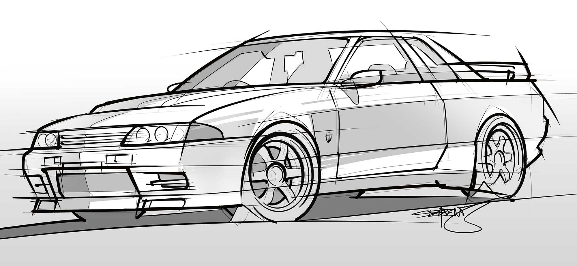
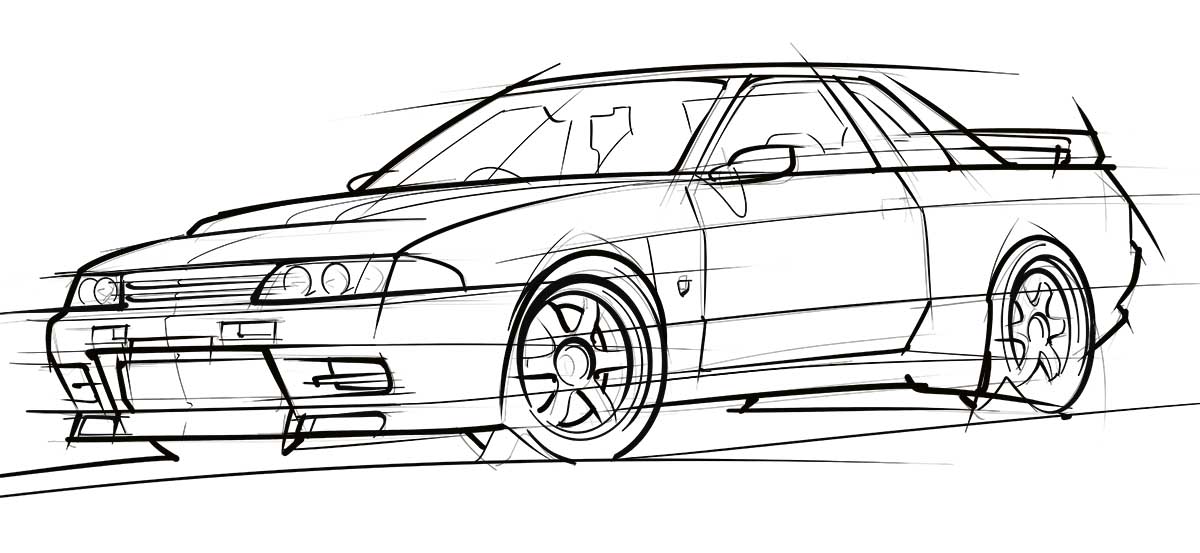
My Drawing of a Nissan R32 GT-R
If there’s anything to be learned from this post, it’s that your skills of an automotive illustrator will decline if you don’t practice often enough.
This drawing of a Nissan R32 GT-R is the first car sketch that I’ve done in 8 years. It was hard. I felt rusty. And you know what? I’m not all that pleased with the way that it came out.
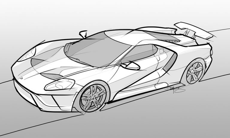
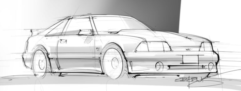
If you compare it to my drawing of a Ford GT (which I did in 2017), you can see how much better my line control was back then. This GT-R sketch ended up too messy for my liking.
The step-by-step process of how I drew this GT-R
In all, it took about 2 1/2 hours to complete this illustration. Most of that time was spent trying to relearn how to draw straight lines (lol).
This is a 100% digital sketch by the way. The software I used was Adobe Photoshop and Autodesk Sketchbook Pro. I also use a Wacom Intuos Pro drawing tablet.
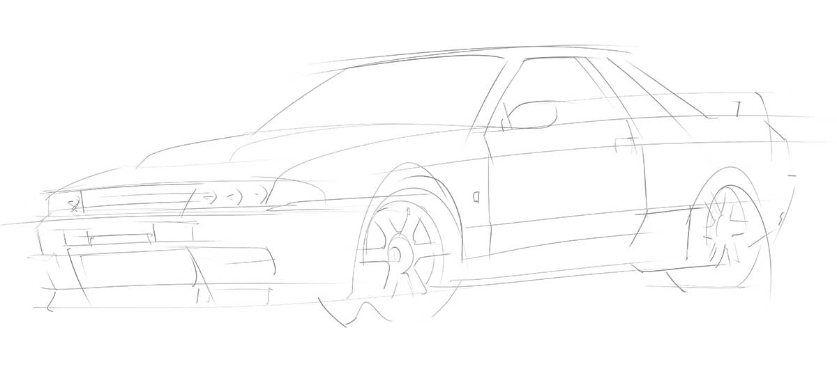
Step one: creating the loose line work
In Photoshop, I began sketching out the general shape of the car with a very thin brush:
Step two: laying down stick perimeter / edge lines
Once I had the general shape of the car looking halfway decent, I switched to a heavier brush and began laying down the outlines:
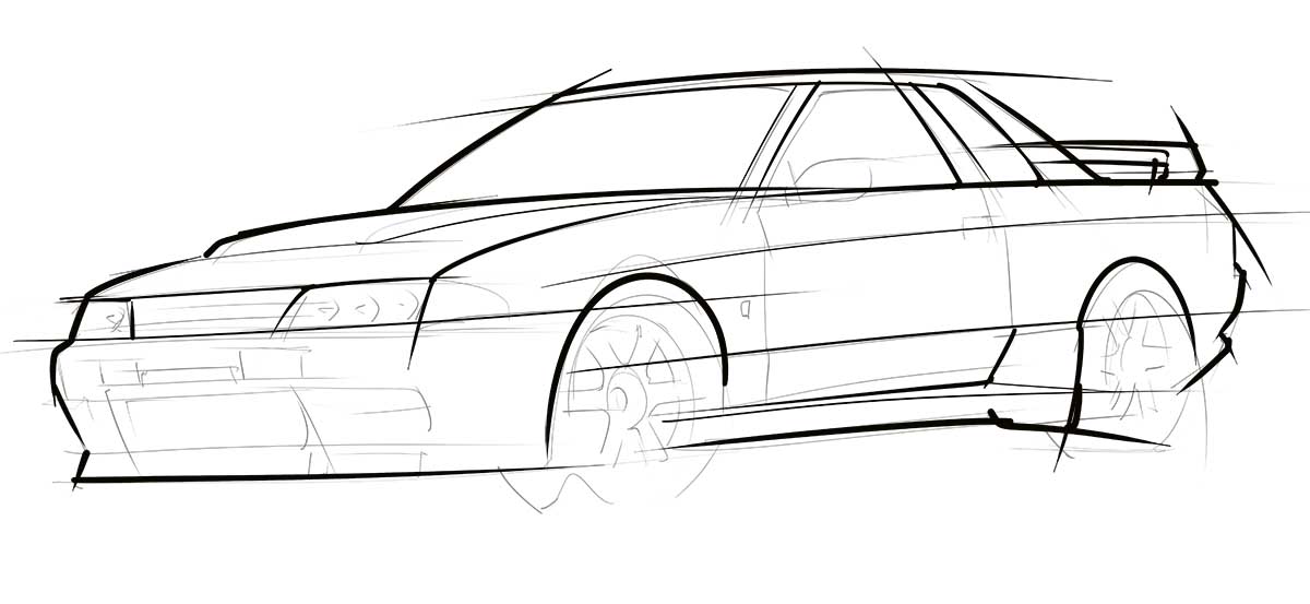
Basically, the idea is to heavily outline the body of the car. These will be the thickest / heaviest lines of the entire illustration.
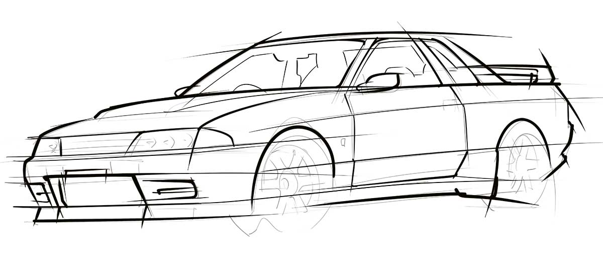
Step three: adding details
With the heavy outside line work complete, I started focusing on the details of the body (using a slightly thinner brush).
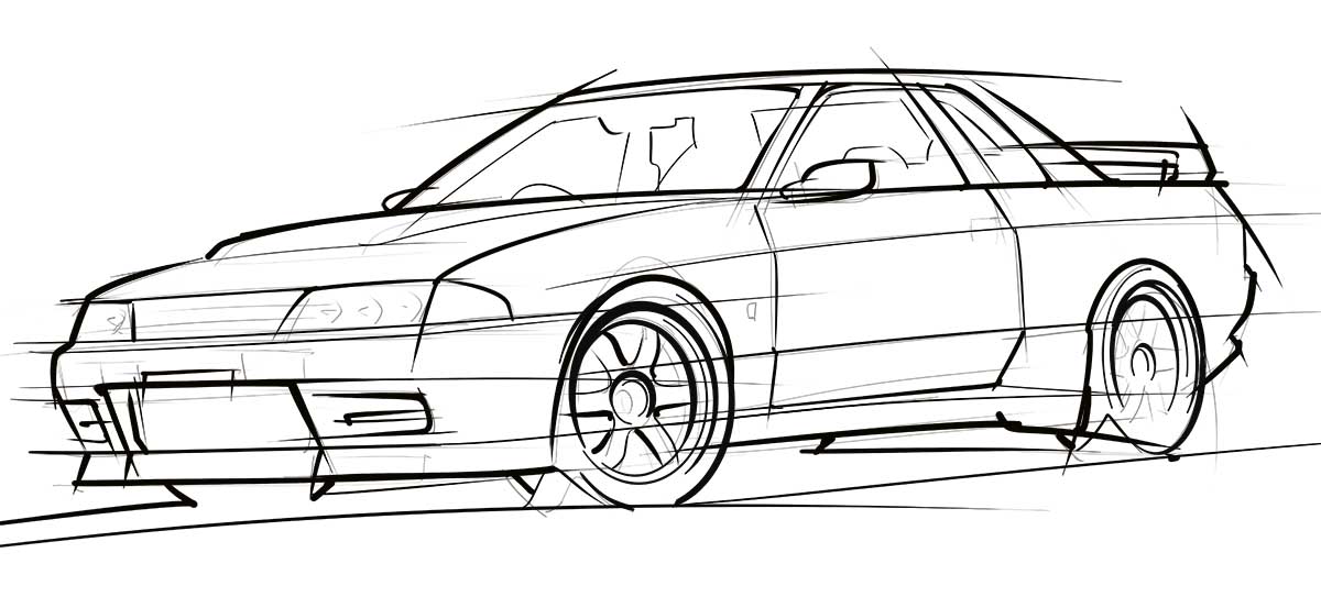
Step four: drawing the wheels and tires
I switched over to Sketchbook Pro to draw the wheels and tires. Basically, Photoshop lacks the proper tools / guides for drawing circles and ovals in a way that allows me to make the result look ‘sketchy’ and spontaneous.
Step five: drawing more detail
This is about the point where I started getting frustrated. The design of the R32 GT-R is very hard edged, and since I freehand everything, it was difficult to get those hard edges looking smooth due to how out of practice I was.
Step six: adding reflections and shading
This is the fun part! Adding a hard reflections and simple shading to a sketch really makes it pop IMHO. The point is to keep it simple!
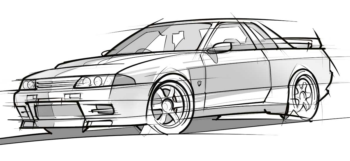
Step seven: adding a background
One of the best (and easiest) ways to make a car drawing really pop off the page is to create some contrast between the body and the background. For this sketch, I added a simple background gradient while keeping the body of the GT-R white.

What I learned
More than anything, I’m upset at myself for going 8 stinkin’ years without drawing any cars. It’s a skill that I never want to lose, but it’s already starting to happen.
This was a wake up call. I need to keep practicing!
The only other thing notable about this illustration is the fact that the R32 GT-R probably wasn’t the best car to draw after coming back from such a long break.
There are too many straight lines IMHO. Considering that I freehand everything (except for the wheels), it was too big of a challenge. I should’ve done something more swoopy…